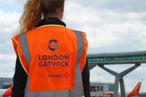
London Gatwick gets a new logo
Links on Head for Points may support the site by paying a commission. See here for all partner links.
Bored of its old, cursive logo, London Gatwick airport has decided it needs to rebrand with something equally …. dull.
According to the press release, the new logo “acknowledges the airport’s proud history” and is “designed to reaffirm and showcase London Gatwick’s position as a major international gateway.”
See what you think:
Personally I’m struggling to see any connection to aviation but I’m sure an expensive design agency can justify it at length …..
Fortunately, Gatwick Airport is also spending some cash on the customer experience:

“Accompanying the new brand and vision is an exciting multi-million pound development programme. This significant programme of investment includes the expansion and refurbishment of departure lounges to create more modern, appealing spaces for passengers, while at the same time considering the airport’s sustainability goals.”
The airport also announced that the upgrade to the rail station is due to be delivered on schedule later this year.


 Rob
Rob 


Comments (24)